

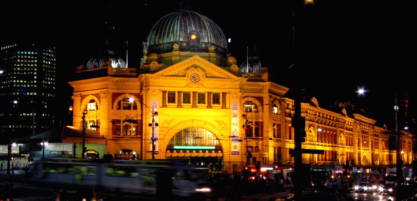
This is part 2 of an assessment of the six shortlisted entries into the Flinders Street Station Design Competition.
(If you haven’t read Part 1 click here to see my take on the first 3 Schemes)
Eduardo Velasquez + Manuel Pineda + Santiago Medina
The first thing that must be said about this teams remarkable effort, is that they are students of Architecture and are battling it out with some of the most prestigious Architecture firms worldwide. The big idea with this scheme is to incorporate a generous public park above the station. This would make a glorious green open space in the heart of the city.
Another bold move is to relocate the existing tram stop between the Station and Federation Square so that it is on the Princess Bridge further south. This would be combined with closing vehicular traffic to create a massive pedestrian thoroughfare between Federation Square and Flinders Street Station. I am personally not sold on this idea as I believe it would make the transport connection between tram and train awkward in bad weather.
Overall the big idea in this scheme is an excellent selling point. On the critical side, the architectural refinement in some areas such as the glass box connection with the administration building and the ceiling and column details from the station platforms leave room for improvement.
|
Scorecard Eduardo Velasquez + Manuel Pineda + Santiago Medina
|
|
| Overall Design Merit | 4 |
| Transport Function | 3 |
| Cultural Heritage and Iconic Status | 3 |
| Urban Design and Precinct Integration | 4 |
|
Total Score |
14/20 |
This project did not create a fantastic first impression as the animation focussed significantly on the computer generated plastic looking characters within the space. Looking deeper into the scheme however revealed that it has significant design merit. Reverence has been paid to the history of the site by glazing over the cast iron columns of the eastern concourse. A new canopy references the originally designed but never built grand vaulted roof.
From a transport perspective this scheme suggests pushing the Swanston Street tram stop closer to the station making the connection with the station shorter and separating it from through traffic.
Another out of the box idea is to repurpose the administration building into a (hopefully public) high school. This has the benefit of providing a very much needed service in the area, rather than just relying on retail to attempt to fill the space. The additional benefit here is that it could be argued that some of the money to build this proposal could come from the education budget in exchange for providing a new school.
In terms of the look and feel of the presentation, it does resonate with me as having an Australian character about it. It is not sleek and elegant but complex and robust.
|
Scorecard Ashton Raggatt McDougal
|
|
| Overall Design Merit | 4 |
| Transport Function | 4 |
| Cultural Heritage and Iconic Status | 4 |
| Urban Design and Precinct Integration | 4 |
|
Total Score |
16 / 20 |
This project takes the vaulted ceiling concept from the unrealised original canopy design and reinterprets it into a single gesture which expands at a low level across the site. The architects describe their weaving vaulted form brilliantly as follows.
“The structural weave provides unity and beauty in a modern expression encapsulating the classic station genre that disperses dappled natural light and ambience through the entire station realm.”
The interface with Federation Square, in my view, is perhaps the best out of all six schemes. The new structure clearly has a relationship with the existing icon whilst being in itself elegant and subtle. The urban design and precinct integration also succeeds in the centre of the site with a new amphitheatre facing a pontoon stage on the Yarra. I could easily imagine Moomba, New Year’s Eve and other celebrations making good use of this space.
I am less convinced by the built form at the western end of the site as the proportions reduce the elegance of Eastern end. I am also sceptical of the viability of the market space as there appears to be no vehicle access to set up or supply the stalls
Overall however this is an excellent scheme which has a lot going for it.
|
Score card Hassell + Herzog & De Meuron
|
|
| Overall Design Merit | 5 |
| Transport Function | 4 |
| Cultural Heritage and Iconic Status | 5 |
| Urban Design and Precinct Integration | 4 |
|
Total Score |
18/20 |
Conclusion
All of these excellent schemes have merit in different ways. They are complex and immense in their scope and detail. After reviewing each scheme the Red + Black scoreboard is as follows:
|
Red + Black Final Scores |
|
|
Hassell + Herzog & De Meuron |
18/20 |
|
Ashton Raggatt McDougal |
16/20 |
|
NH Architecture |
15/20 |
|
Zaha Hadid Architecture + BVN Architecture |
14/20 |
| Eduardo Velasquez + Manuel Pineda + Santiago Medina | 14/20 |
|
John Wardle Architects + Grimshaw |
13/20 |
This is my opinion, but what do you think? Please feel free to add your comments below and most importantly don’t forget to vote.
Architecture is for everyone!
Leave a Reply